 Kuiper Studio
Why restaurants fail: the offer, the message, then the menu
Once the location is measured, the order of decisions matters as much as the decisions. The offer follows the people walking past your door, the message follows the offer, and the menu is written last, out of the message. That is the opposite of how almost everyone does it.
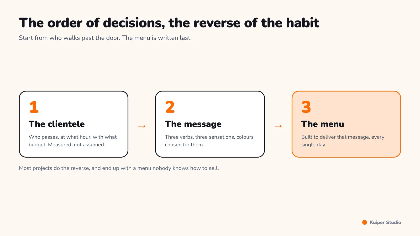
In the first article of this series we measured the flow past the door and read the catchment area. So you know who walks past, at what hour, and with what budget. The question now is what you sell them, and in what words.
The offer follows the clientele, never your own taste
This is where most projects go wrong. People open what they like to eat, not what the street buys. Occasionally those coincide, by luck. Usually they do not.
Take a concrete case. You open next to a school. A bar might attract a few parents, but the flow on offer is the school run, and a parent having a drink while waiting for their child is not a clientele to build a business on. That same flow, however, buys something else very willingly.
- Sweet rather than savoury, and simple textures rather than complex ones.
- Short recipes, executable in under two minutes at peak.
- A low ticket and high volume, concentrated into one or two hours a day.
- A format that holds in one hand and is eaten standing, on the pavement.
Ice cream, churros, fries, waffles: these are not chef's choices, they are answers to a flow. Next to an office tower or a government building the same reasoning gives a radically different result: lower volume, a higher ticket, a shorter service window, and a much stronger demand for consistency.
The rule, in one sentence
You do not choose an offer and then look for a clientele. You observe a clientele, identify what they lack at the hour they walk past, and build the offer from there. If you cannot name the person you are selling to and the hour they pass, the offer is not ready.
Big menu or small menu? It depends on your kitchen
People often say a big menu is a mistake. It is not, and the question is badly framed. There is a pizzeria near me that also serves burgers and a great deal more. Its menu is very wide, and it works, because it runs a central kitchen. It has the capacity to carry it.
The right question is not the size of the menu, it is the ratio between the menu and real capacity. A wide menu with a central kitchen and trained staff is a commercial advantage. The same menu with two people on the line produces shortages, waiting, waste, and quality that collapses at the first rush.
What menu size actually demands
| Menu size | What it needs behind it | Main risk |
|---|---|---|
| Short, 8 to 12 dishes | A small team, simple stock | Regulars get bored |
| Medium, 15 to 25 dishes | Maintained recipe cards, a section chef | Cost drift, shortages |
| Wide, over 30 dishes | Central kitchen or prepared production | Quality and waste, if capacity is missing |
The message before the menu: finding the tone
Many founders think announcing the opening is enough. You open, you say so, people come. Yes and no. They come once. What brings them back, and above all what makes them talk about you, is a recognisable tone.
In food, tone is sensory, not argumentative. You are not selling a composition, you are selling an expected sensation: crunch, smell, sweetness, char, melt. Verbs matter more than adjectives: come and bite into, come and smell.
This is not an adman's hunch. In 2004 Massimiliano Zampini and Charles Spence showed that simply amplifying the sound of the bite made the same crisps be judged crunchier and fresher by participants. The sound changed the perception of the product while the product stayed identical. The sensory promise is part of the product.
2 to 20 kHz
the frequency band whose amplification alone makes a crisp be perceived as crunchier and fresher, with the product unchanged
<small>Source: Massimiliano Zampini and Charles Spence, Journal of Sensory Studies, vol. 19, no. 5, pp. 347-363, 2004</small>
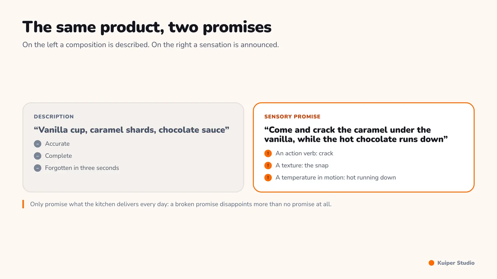
Same product, two promises. On the left a composition is described, on the right a sensation is announced.
Colours are not a matter of taste
If you are after children and their parents, bold colours work: pink, yellow, blue, red. This is not an aesthetic preference, it is a signal readable at five metres by someone who cannot read yet.
Here too the research is clear. In a review published in the journal Flavour in 2015, Charles Spence concludes that colour is the single most powerful visual cue setting what a person expects to taste. He adds a useful warning: when the colour does not match the taste, the disappointment is sharper than if there had been no signal at all.
The warning that comes with it
A colour, a word or a smell promising what the plate does not deliver works against you. Sensory marketing raises expectation; if the product does not meet it, the guest is more disappointed than if they had expected nothing. Promise only what the kitchen can produce every single day.
Building the menu out of the marketing
I hold a deliberately contrarian principle: I build the menu out of the message, not the message out of the menu. Start from the clientele, derive a tone, look for trends matching that tone, and only then write the menu. Here is the full reasoning on one example.
Step 1, the base
We sell ice cream outside a school. Few flavours, but good ones: chocolate, vanilla, strawberry. You will say: like everyone else. Exactly. That is the base, it has to be faultless, and it does not set you apart.
Step 2, indulgence
Add what is visible and chosen: chocolate sweets, gummy sweets, caramel shards, cake pieces, and sauces picked by the customer, caramel, chocolate, strawberry. The customer composes. This is the first layer of differentiation, and it costs little.
Step 3, what gets photographed
Indulgence alone does not get you talked about. You need something that photographs, and that something is often the container. The waffle bowl already exists everywhere. So look further: what if the spoon were edible too? These are leads, not answers. The point is the method: you deliberately hunt for the object that will be photographed instead of hoping one appears.
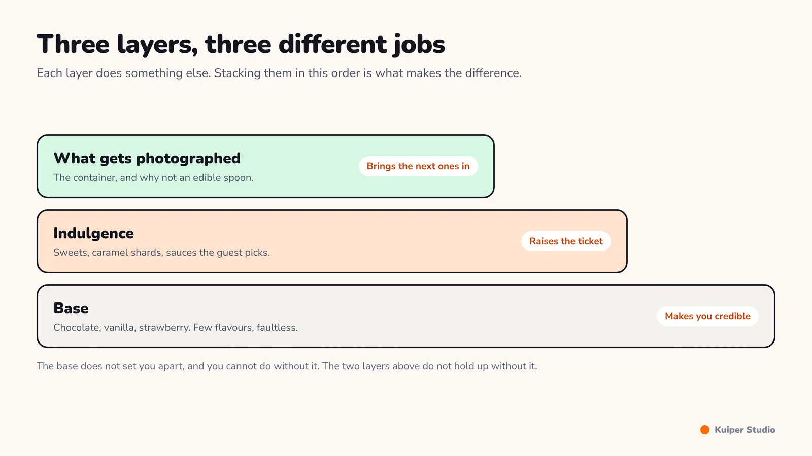
The base makes you credible, indulgence raises the ticket, the container brings the next customers in.
- Name the target clientele and the hour they walk past, in one sentence.
- Derive the format, the texture and the acceptable service time.
- Write the tone: three verbs and three sensations, not a list of ingredients.
- Choose colours from that clientele, not from your own preferences.
- Build the base of the menu, short and faultless.
- Add a layer of customisation the guest composes themselves.
- Explicitly hunt for the element that will be photographed and shared.
At this point you have a clientele, a message and a menu. What is missing is the most thankless and most decisive part: knowing what each item really costs, and what to sell it for. That is the subject of the last article in this series.
Frequently asked questions
Should the menu be built before or after the marketing positioning?
After. Positioning follows the clientele walking past the door, and the menu is built from that positioning. The reverse order produces a menu that is coherent for the cook and unreadable for the guest. It is a deliberate and minority principle in the trade, but it avoids most lopsided menus.
Is a large menu always a mistake in a restaurant?
No. A wide menu is a commercial advantage when production is prepared ahead or centralised and the team is sized for it. It becomes a problem when two people on the line have to carry thirty dishes: shortages, waiting, waste and uneven quality the moment the rush starts.
Do sensory words really increase sales?
What the research shows above all is that they change how the product is perceived. Zampini and Spence established in 2004 that amplifying the sound of a bite is enough for a crisp to be judged crunchier and fresher, with the crisp unchanged. The sensory promise is part of the perceived product, provided the real product lives up to it.
How should a food business choose its colours?
From the target clientele, not from your own taste. Charles Spence concludes in his 2015 review that colour is the most powerful visual cue for setting taste expectation. He also warns that a colour not matching the actual taste causes sharper disappointment than no signal at all.
Sources
-
Massimiliano Zampini and Charles Spence, Journal of Sensory Studies, vol. 19, no. 5, pp. 347-363, The Role of Auditory Cues in Modulating the Perceived Crispness and Staleness of Potato Chips, 2004.
-
Charles Spence, Flavour, vol. 4, article 21, On the psychological impact of food colour, April 2015.
What are we building together?
Tell us where it hurts. We answer with a price and a lead time.